Zrythm DAW
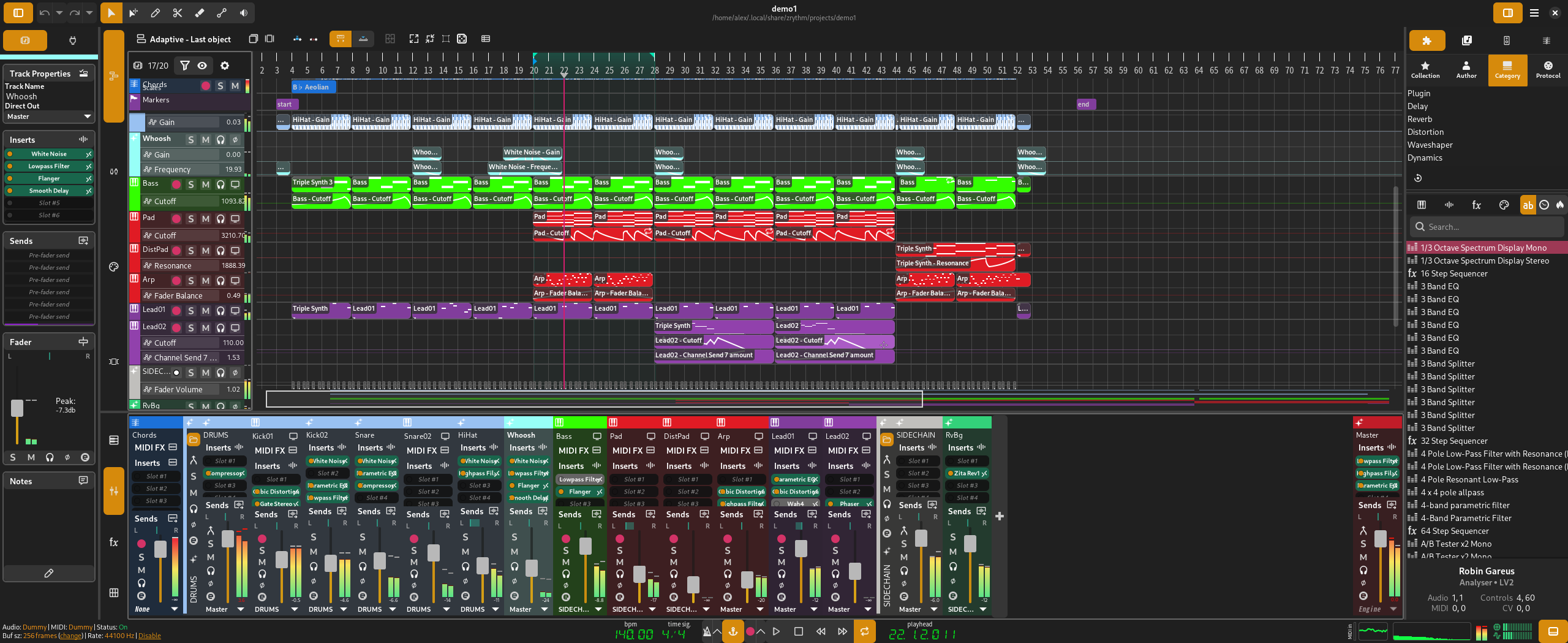
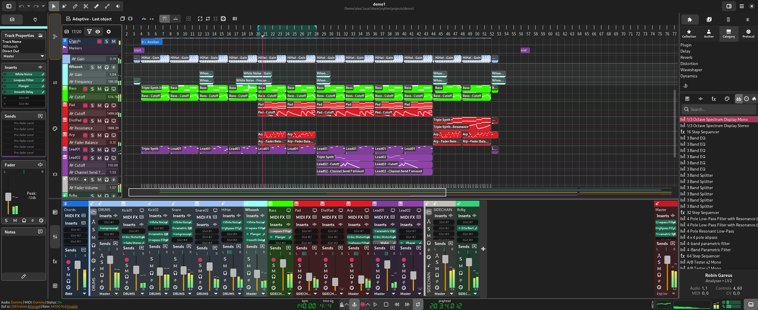
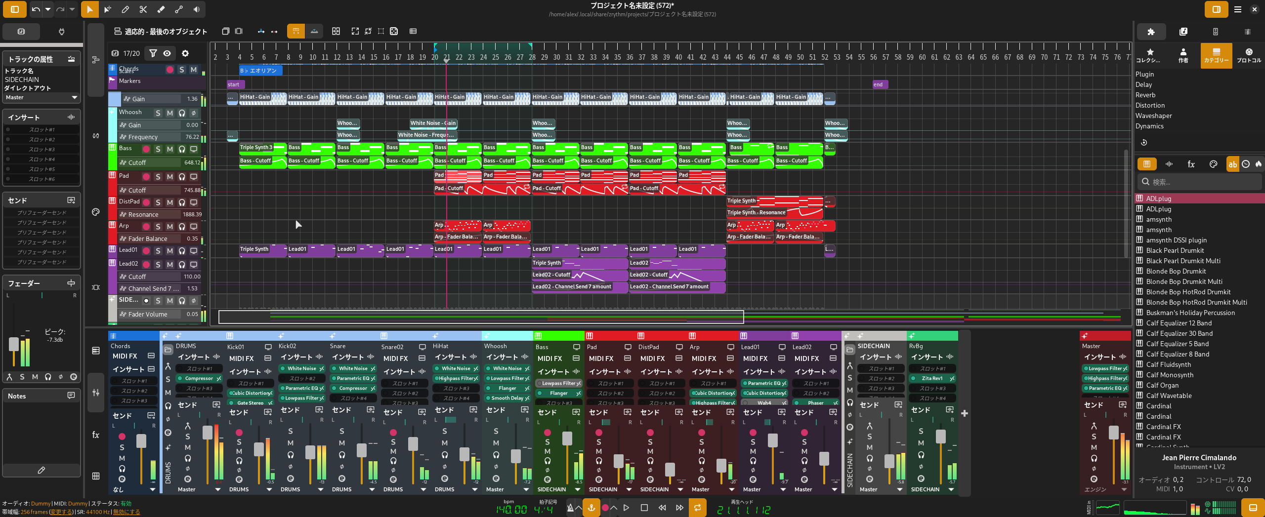
zrythm@mastodon.socialWhich toggle button backgrounds look better?
See https://mastodon.social/@zrythm/111934487568482950
Zrythm DAW
zrythm@mastodon.social@cnx no... the poll button becomes disabled when i attach a file
MortSinyx
cnx@larkspur.oneSince you create polls about @zrythm UI quite often, maybe consider migrate to an implementation that do, e.g. akkoma.social?
Which toggle button backgrounds look better?
Zrythm DAW
zrythm@mastodon.social@cnx sure, if you can recommend a reliable and popular instance. I don't want to join minor instances or host my own - it takes too much of my time when things go bad. Mastodon.social is relatively stable and will be here for a long time.
MortSinyx
cnx@larkspur.one@zrythm, I recall envs.net, a10e, cdrom.tokyo and blob.cat being around before I got here (which is like 5 years now, time flies), operated by respectable admins and likely to last until the end of the world (as we know it). Nothing is too big to fail though, mastodon.social included.
@zrythm I clicked grey, but it's not really that the orange looks bad but that it's so high contrast that it's distracting. The orange has character to it that could be saved by bringing the dark background up a bit.
Jure Repinc 

JRepin@mstdn.io
@jonulrich @zrythm Same here, voted grey, but would like orange more if it was much less saturated.


